



20 Summer Home Decor Ideas to Refresh Every Room With Color
A room that felt fine in February can seem oddly heavy by July, when the light changes and everything looks a little tired.
Summer home decor ideas tend to work best when they focus on color and texture rather than buying entirely new furniture.
The practical frustration is usually knowing where to start when a room has several things that could change at once.
A single deliberate swap, like a slipcover or a fresh coat of paint, often resets how the whole space reads.
The 20 ideas here span living rooms, bedrooms, outdoor spaces and kitchens, so there is a realistic entry point whatever the budget or rental situation.
1- Teal Linen Sofa Summer Refresh
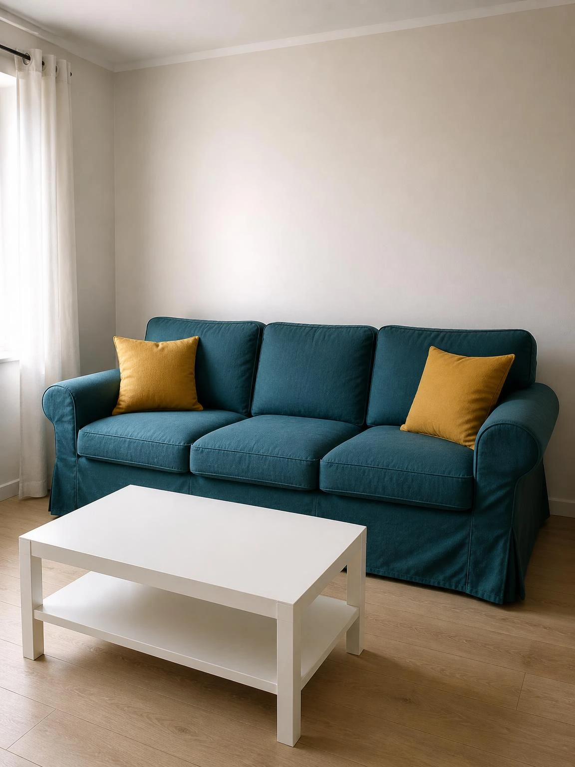
A sofa is the largest surface in most living rooms, so its color does more work than any cushion arrangement.
A fitted slipcover in deep teal linen pulls over the existing frame and closes with a zipper at the back, so the whole thing comes off for machine washing at the end of summer.
Two cotton cushion covers in a restrained mustard at each end of the sofa are enough contrast without making the room feel busy.
Against a warm white wall, the deep teal reads as grounded rather than loud, especially in the soft overcast light that many north-facing living rooms get in summer.
Linen wrinkles easily with daily use; a slipcover in a linen-polyester blend holds its shape better and still looks intentionally textured rather than just creased.
2- Coral Outdoor Dining Chair Cushions
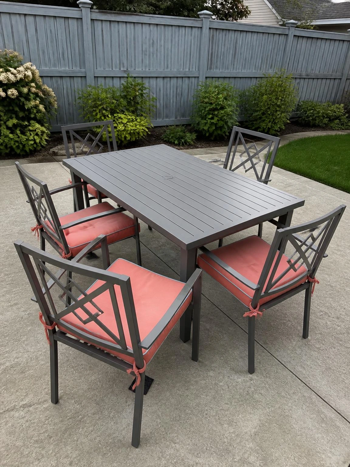
Bare metal patio chairs are uncomfortable enough that people avoid sitting on them, which defeats the point of having outdoor dining.
Tied-on cushions in soft coral solution-dyed acrylic fabric change the comfort and the look of the whole patio in an afternoon.
Solution-dyed acrylic means the color goes all the way through the fiber, so it resists UV fading across a full summer without needing covers between uses.
Muted blue piping on each cushion connects the coral to any blue tones in the surrounding garden or fence without requiring additional accessories.
Tie-on cushions shift in wind; a small square of non-slip rubber mat placed under each one reduces movement without any drilling or permanent attachment.
3- Dusty Blue Bedroom Duvet Switch
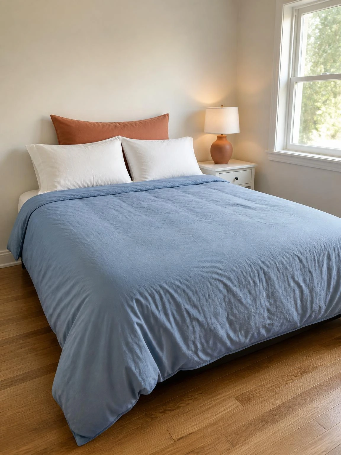
Swapping a duvet cover is the lowest-effort bedroom change and one of the most noticeable, since the bed dominates the room visually.
A dusty blue cotton percale duvet cover on a queen bed reads as genuinely cool rather than just pale, especially against a warm white wall.
Percale has a looser, crisper weave than sateen, which is why a 200-thread-count percale actually feels cooler to sleep under in warm weather despite the lower thread count.
One terracotta euro sham behind two plain white pillow cases adds enough warmth to stop the whole bed feeling cold, without loading it with excess cushions.
Percale wrinkles more than sateen, particularly at the fold lines; tumble drying promptly rather than leaving it in the drum takes care of most of that.
4- Forest Green Entryway Console Styling
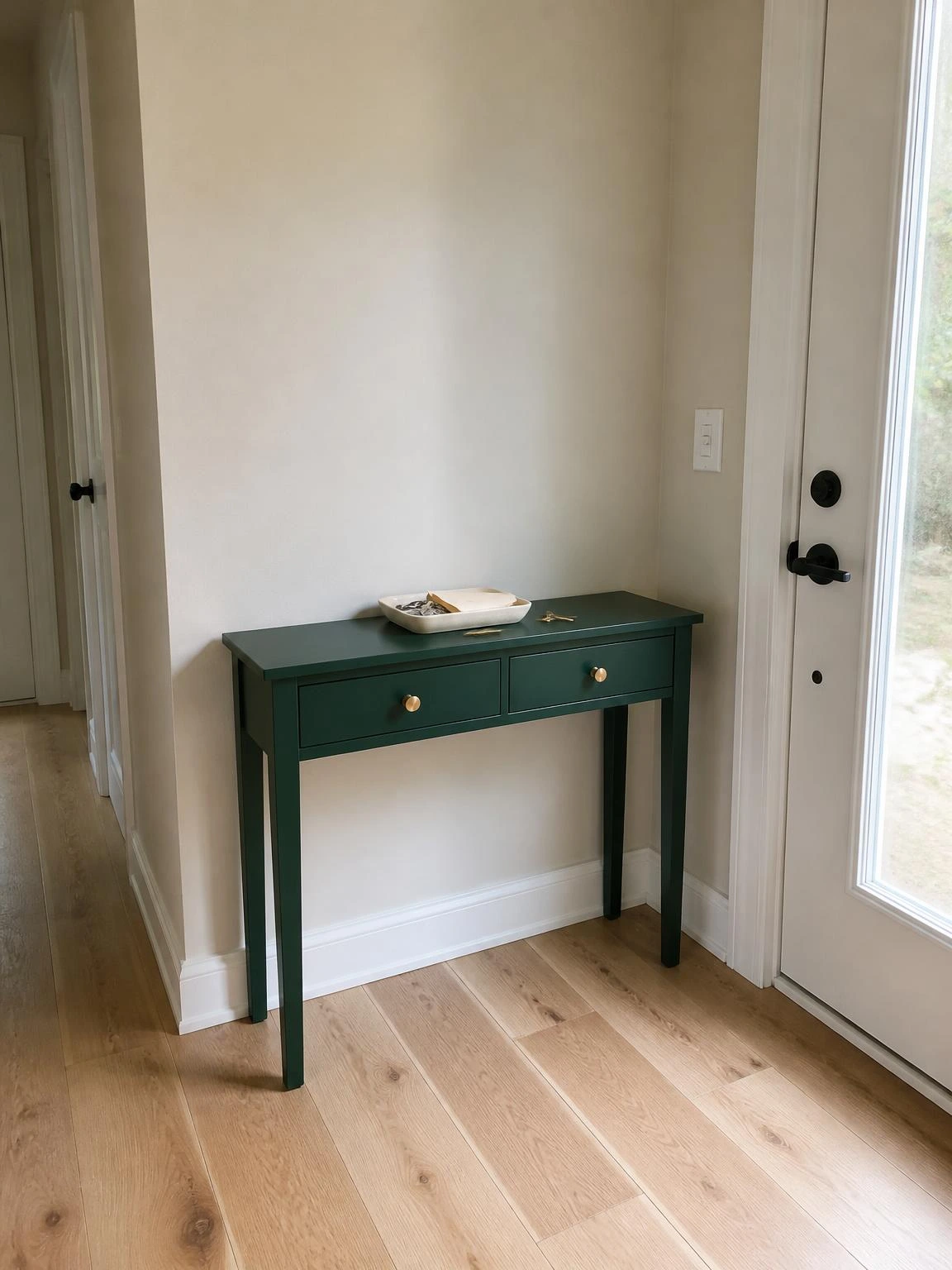
A narrow entryway console is often an afterthought, holding keys and post and not much else.
Painting it in a deep forest green matte finish makes it a focal point the moment someone opens the front door, without any structural change to the space.
Two coats of matte water-based furniture paint followed by a clear water-based topcoat protect the surface against the daily scratching that keys and bags cause.
Brass-finish drawer pulls are worth the small upgrade here because they catch the light against the dark green in a way that flat chrome does not.
Dark paint on a small console can make the surrounding space feel heavier, so keeping the wall behind it in a light warm neutral preserves the breathing room in the hallway.
5- Plum Velvet Dining Chair Seats
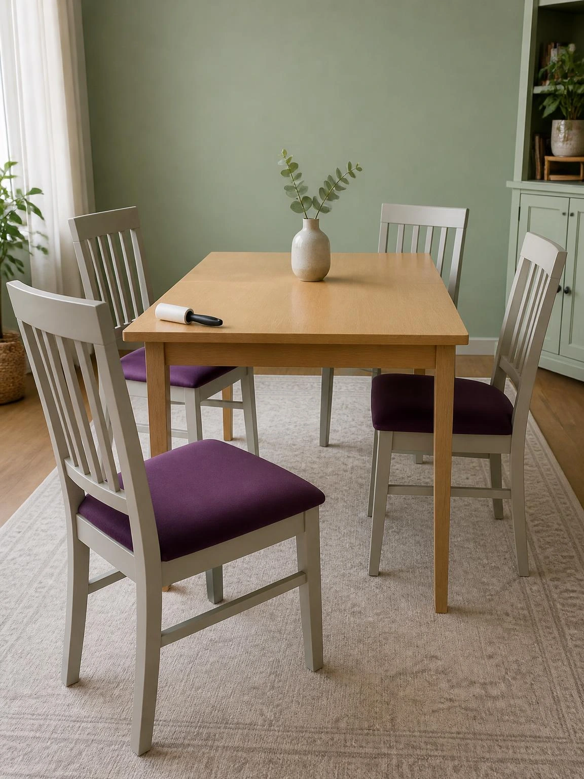
Re-upholstering dining chair seats is one of the more accessible DIY furniture updates because the seat pad is usually just four screws from the underside of the frame.
Muted plum cotton velvet on the seat pads, with stone-colored painted chair frames, reads as considered rather than theatrical, particularly against a soft green wall.
Cut the foam padding about 5mm larger than the seat base on each side before stapling the velvet over it, so the fabric pulls taut and the corners stay crisp rather than gathering.
The light wood dining table in the center stops the plum and green combination from feeling too dark for a summer room.
Velvet attracts pet hair reliably; a lint roller before guests arrive is faster than vacuuming the whole chair and handles it just as well.
6- Navy Outdoor Rug on a Timber Deck
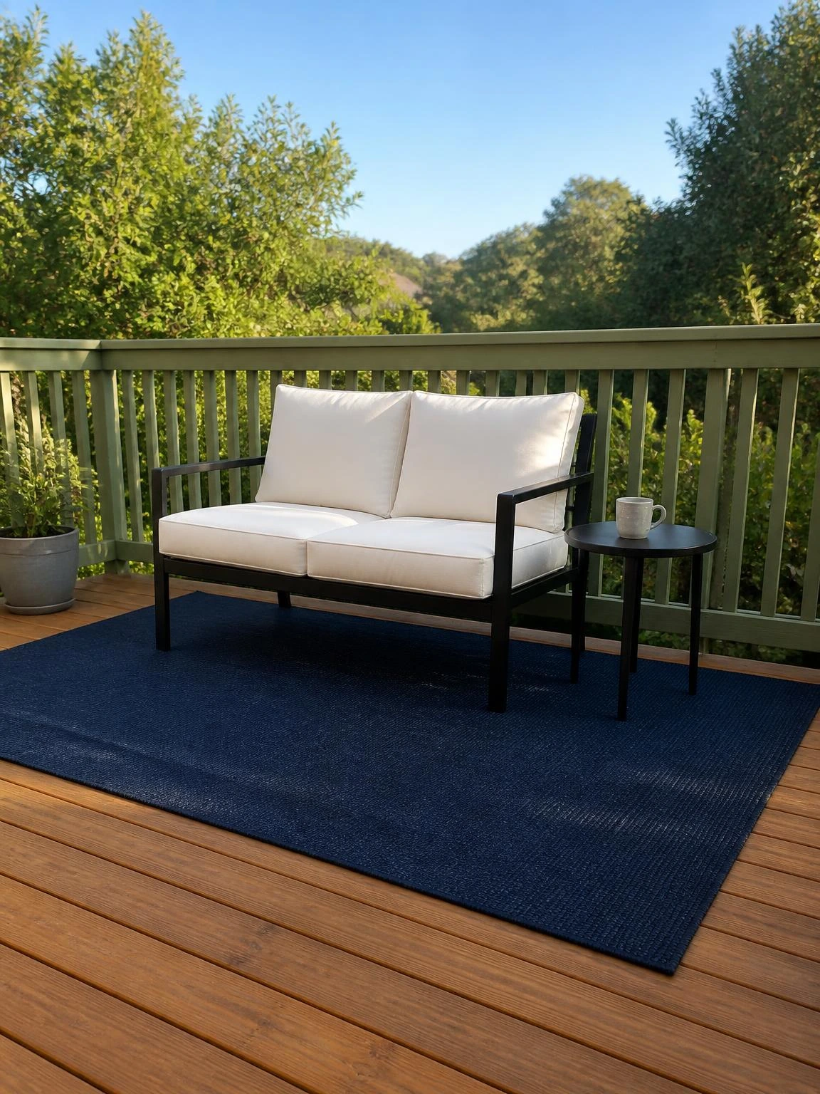
A timber deck without a rug tends to feel like a functional surface rather than somewhere to actually sit and stay a while.
A flat-weave navy polypropylene outdoor rug under a two-seat loveseat and side table defines the seating area the same way a living room rug anchors a sofa arrangement.
Ivory cushions on the loveseat keep the palette from going too dark, and the muted green of a painted deck railing ties the whole arrangement to the garden.
A non-slip rug pad cut to match the rug dimensions prevents it from creeping across smooth decking when people get up and sit down.
Polypropylene holds moisture beneath it on timber, so lifting the rug and allowing the deck surface to dry out once a week prevents mould forming on the boards underneath.
7- Rust Linen Curtains in a Sunny Living Room
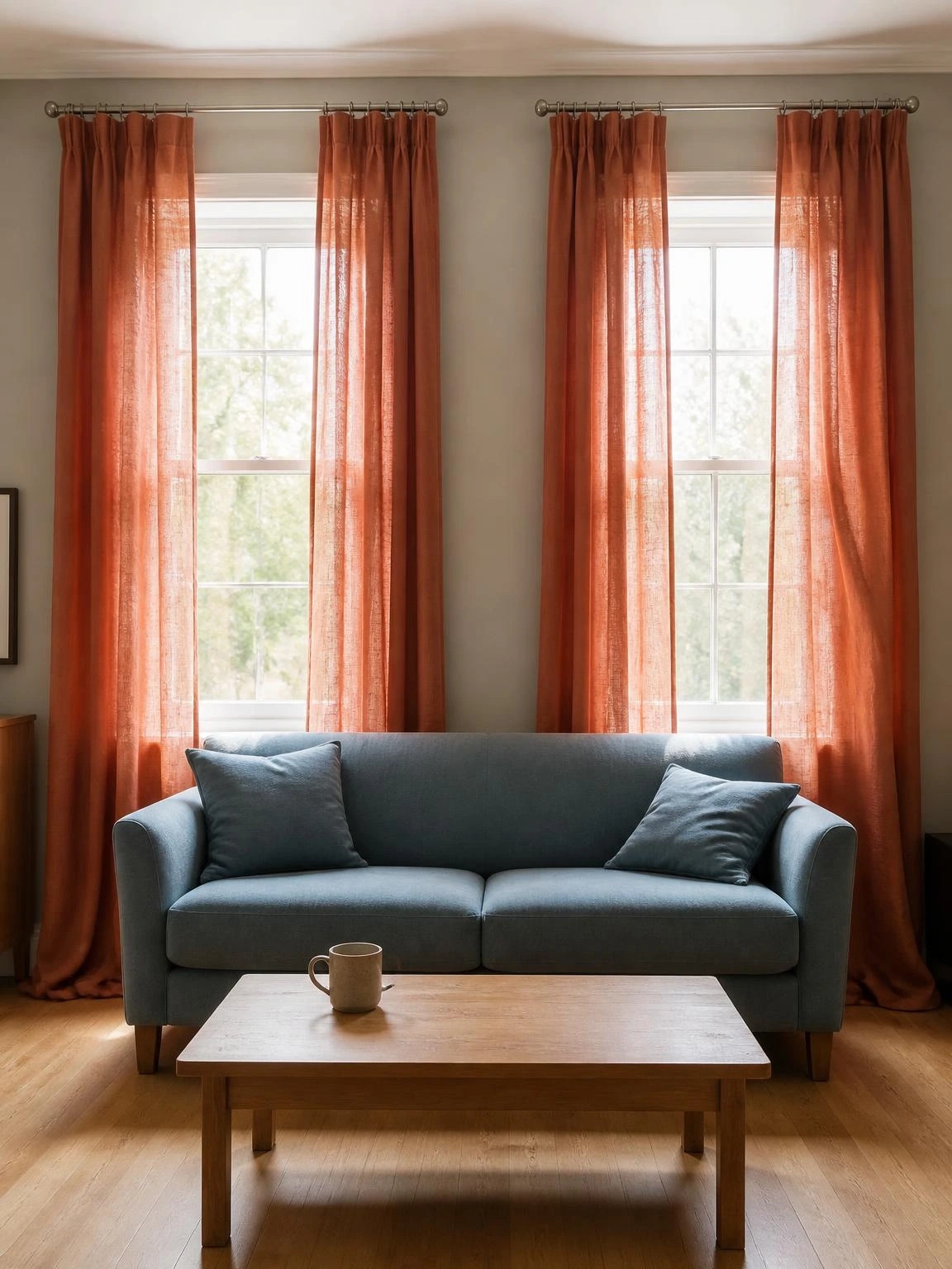
Standard window treatments in living rooms are often neutral by default, which means there is usually an easy opportunity to introduce color at the windows without touching anything else.
Floor-length rust linen panels on brushed metal rods warm up a room that has a soft blue sofa without the two colors fighting each other.
Hanging the rod 15 to 20 centimeters above the window frame rather than directly on it makes a standard-height ceiling look taller without any construction work.
Linen at the window filters rather than blocks light, so the fabric texture shows through beautifully on bright mornings and the room stays light and open.
Linen fades in direct strong sunlight over several seasons; a linen-cotton blend holds the rust color longer on south or west-facing windows.
8- Burgundy Accent Wall in a Home Office

A home office with all-neutral walls tends to feel provisional, as if the room is waiting to become something else.
One burgundy wall behind the desk changes the atmosphere of the room considerably, making the space feel more deliberate without any furniture changes.
Tinting the primer to a medium gray before applying burgundy reduces the number of finish coats needed to achieve full, even coverage on a previously white wall.
Warm gray on the remaining three walls stops the burgundy from overpowering a compact room, and an ivory desk chair keeps the foreground light.
A dark accent wall does absorb natural light, so positioning the desk to face a window rather than the accent wall makes the working hours more comfortable.
9- Teal Kitchen Cabinet Door Refresh
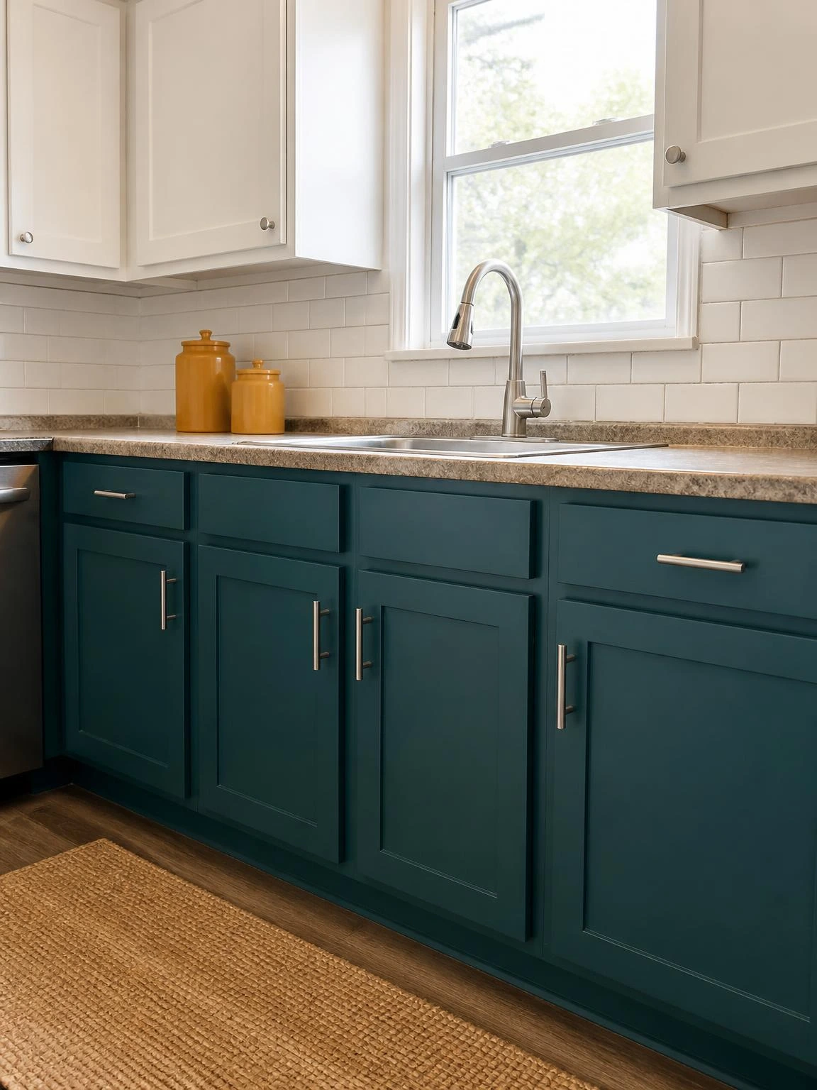
Repainting only the lower cabinet doors in a kitchen is a practical middle ground between a full renovation and doing nothing.
Deep teal on the lower cabinets with warm white uppers and brushed nickel bar pulls is a combination that works particularly well with a white subway tile backsplash.
Lightly sanding the doors with 220-grit paper and applying a bonding primer before painting is the step that determines whether the paint lasts or peels within a season.
Mustard-toned ceramic canisters on the counter connect the teal kitchen palette back to the living room slipcover colors if the two spaces are open to each other.
Matching the teal exactly if a door needs repainting later can be difficult, so keeping a small labeled jar of the mixed paint color is worth doing before closing the tin.
10- Coral Bathroom Towel and Mat Set
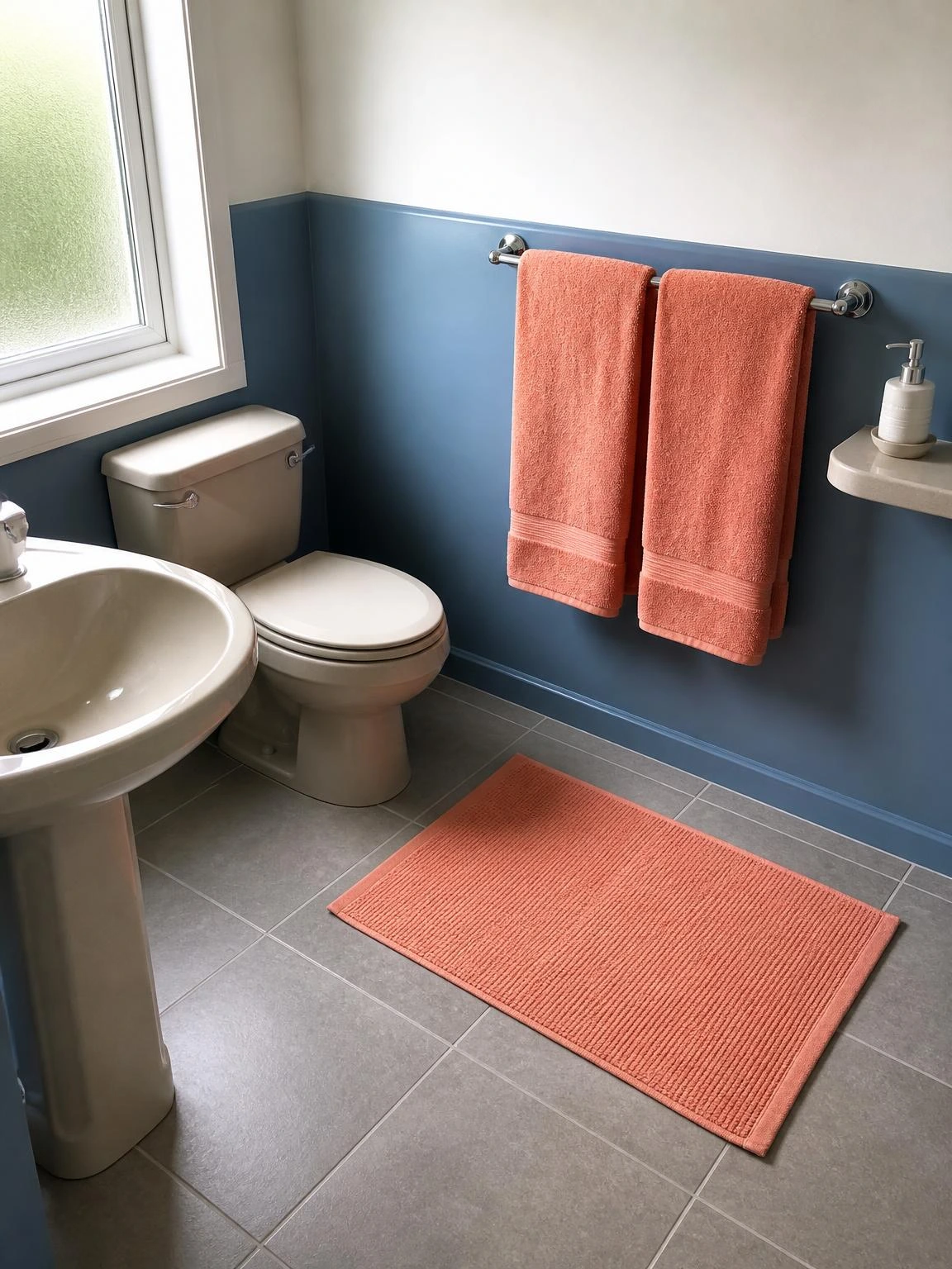
A bathroom refreshed with new towels feels like a more significant change than it logically should, probably because towels are the most touched surface in the room.
Soft coral 600gsm cotton towels on a chrome rail with a matching bath mat on grey tile floor shifts the whole bathroom palette without touching the fixtures or walls.
Against a muted blue lower wall, the coral reads as warm without being garish, and the stone-colored ceramic fixtures sit neutrally between the two.
Washing new towels twice before first use removes the finishing agents applied during manufacturing and noticeably improves absorbency from the start.
Coral is a dye-sensitive color; a cool wash cycle with a color-safe detergent preserves the hue considerably longer than regular hot washes.
11- Dusty Blue Painted Porch Floor
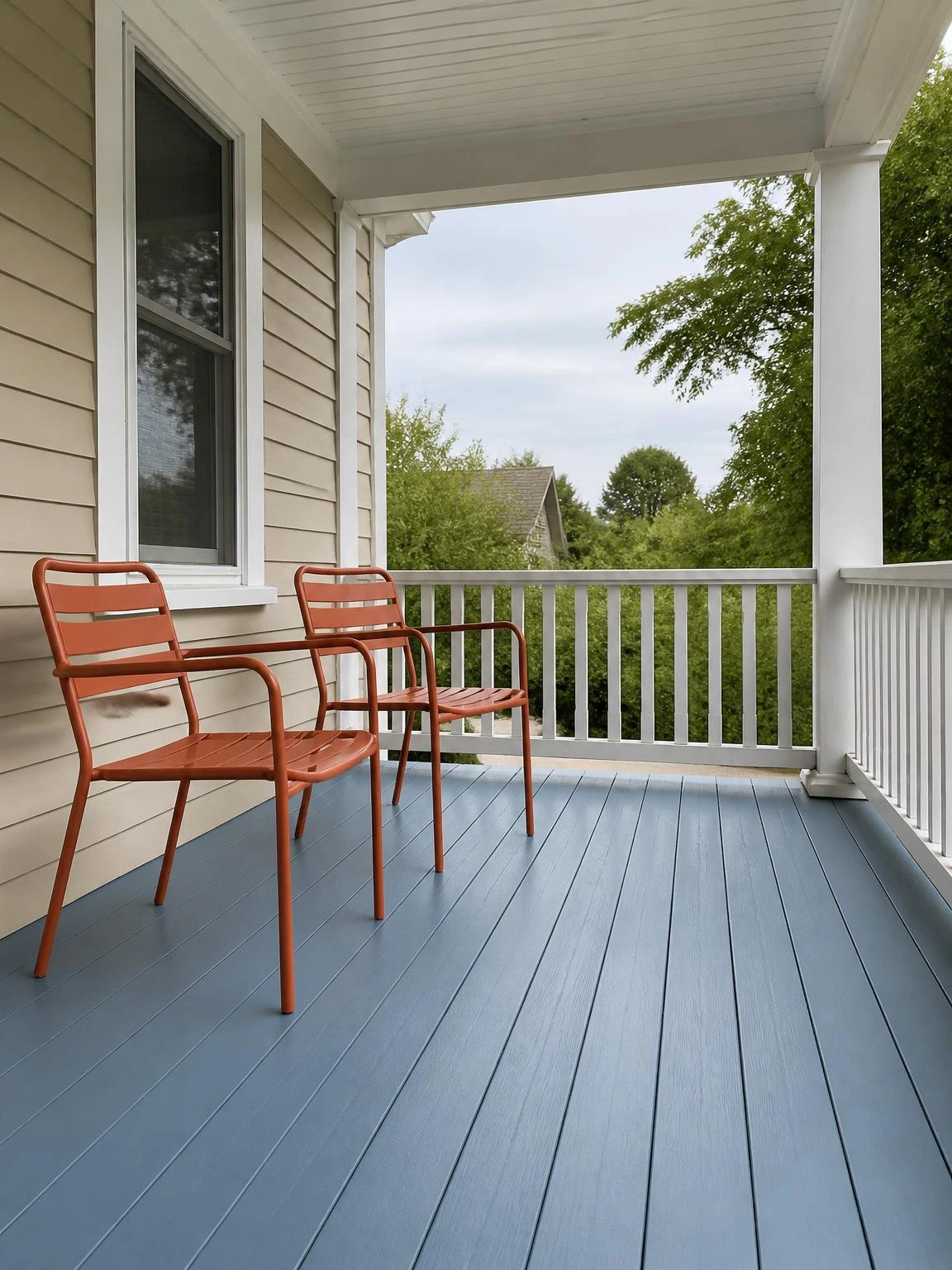
A covered front porch floor that has never been painted is raw timber or bare concrete, and both look neglected rather than intentionally simple by midsummer.
Dusty blue porch-and-floor enamel on the boards, with a warm white railing and terracotta metal chairs, turns a plain porch into a room that people actually want to sit in.
Apply the enamel in two thin coats rather than one heavy one, and allow a full 72 hours of cure time before moving the chairs back to prevent paint transfer to the feet.
An oil-modified enamel holds up better underfoot than standard wall paint, which can scuff and peel quickly in an outdoor space that gets foot traffic in summer sandals.
In climates with strong summer sun or freezing winters, a painted porch floor will need a fresh topcoat every two to three years to stay looking intentional.
12- Forest Green Garden Bench Repaint
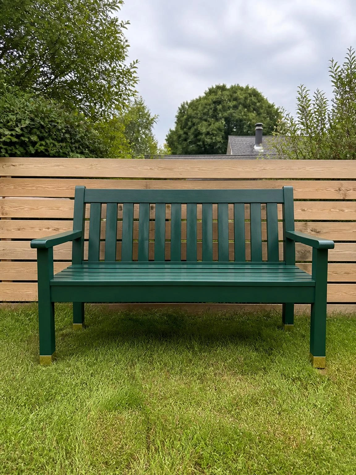
A timber garden bench that has been left outside for a few summers often looks grey and overlooked even when the structure is perfectly sound.
Forest green exterior wood paint over a properly primed surface makes the bench look new and ties it to the garden without trying to match the planting exactly.
Sanding the whole bench down to a smooth surface before priming is the step most people skip, and it is also the reason paint peels off outdoor furniture within a single season.
One coat of exterior wood primer followed by two coats of topcoat gives the green enough depth to read as a proper color choice rather than a quick cover-up.
Timber left outdoors year-round dries out and checks between seasons; an annual touch-up coat on any bare wood spots prevents moisture getting into the grain.
13- Plum Throw Blanket on a Reading Chair
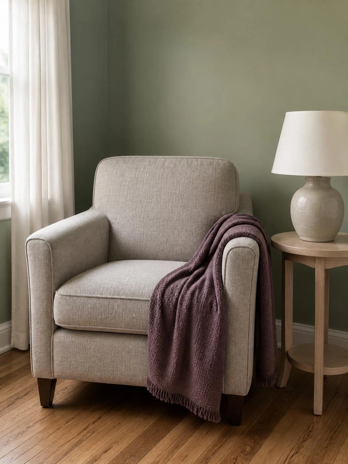
A reading chair in the corner of a living room is the one piece of furniture that earns a single well-placed throw without looking overdressed.
A muted plum cotton-weave throw draped over one arm of a stone-colored armchair introduces the plum from the dining chairs into the living room in a quieter way.
A cotton-weave throw at around 300gsm is the right weight for summer evenings when the air conditioning is on but a full blanket would be too much.
Against a soft green wall, the stone chair and plum throw sit together without either color competing for attention.
Cotton throws crease in a storage basket; draping it loosely over the chair arm keeps it ready to use and avoids the permanent fold lines that take a wash cycle to release.
14- Navy and Ivory Striped Outdoor Umbrella
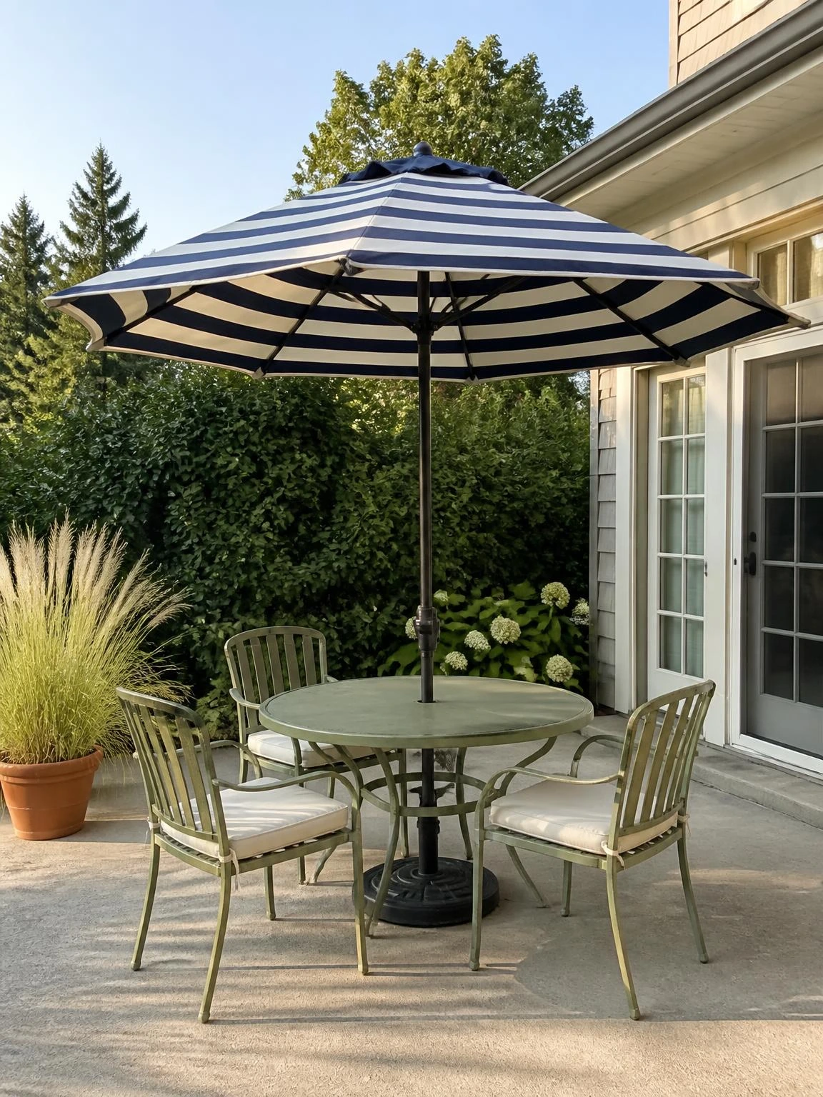
A patio table without an umbrella goes unused on bright summer days in most parts of the US, UK and Canada simply because sitting in direct sun over lunch is not comfortable.
A navy and ivory striped market umbrella in solution-dyed acrylic provides genuine shade and makes the whole patio area look considered rather than accidental.
A 25kg weighted base is the practical minimum for a 2.7-meter umbrella in light summer breezes, and a lighter base will tip in most afternoon wind.
Muted green metal chairs around the table underneath connect the patio palette without requiring the umbrella, chairs and table to all match exactly.
The umbrella should be closed and strapped whenever wind picks up beyond a moderate breeze; an inverted canopy in a gust does real damage to the ribs and pole.
15- Rust Ceramic Table Lamp Swap
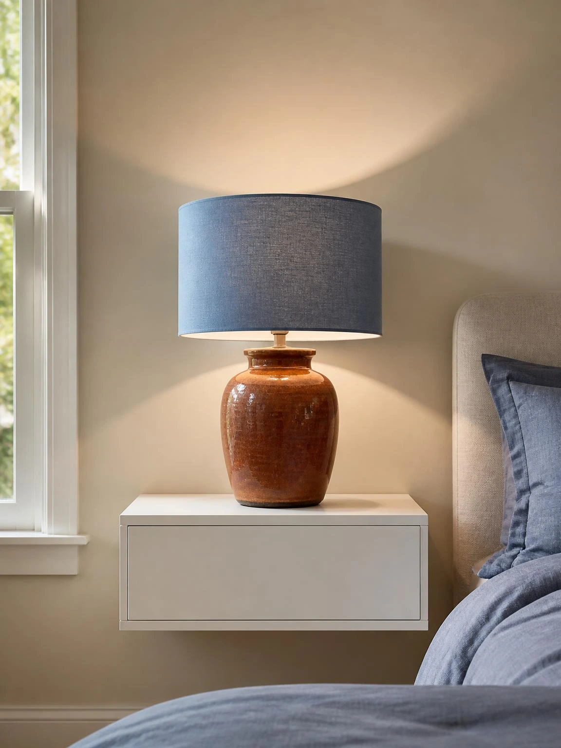
A bedside lamp is a small object that gets looked at every day, and a rust-glazed ceramic base does noticeably more for a bedroom than a plain white resin one.
The rust glaze on a ceramic base, paired with a soft blue linen drum shade, brings the bedroom palette together with the duvet cover swap from section three.
A drum shade with a white interior lining reflects light downward more effectively than a colored or dark-lined shade, which matters for actually reading in bed.
Ceramic lamp bases are heavier than similarly sized resin ones, so it is worth checking that the nightstand surface is rated to hold at least 3 kilograms before switching.
On a painted white floating nightstand with a neutral wall behind, the rust lamp reads as warm and grounded without the bedroom feeling too colorful to sleep in.
16- Burgundy Stair Runner Installation
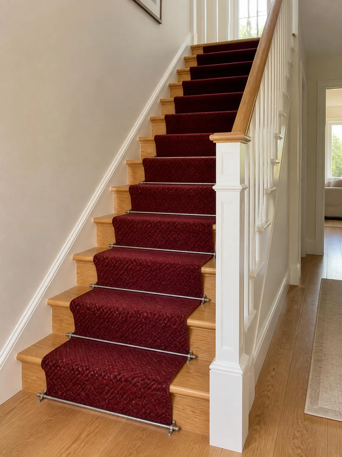
Light timber stair treads show every scuff mark and tend to look worn much faster than people expect when they first install them.
A burgundy wool-blend runner fitted centrally with warm gray metal stair rods protects the treads, reduces noise and makes the staircase feel finished rather than bare.
Installing a tack strip at the back of each tread before laying the runner holds the carpet firmly in place without visible staples showing at the front of each step.
Against ivory painted walls on both sides, the burgundy runner adds warmth to what is usually one of the least decorated spaces in the house.
A stair runner narrows the usable tread width, so fitting it centrally with at least 60 centimeters of tread remaining on each side keeps the staircase safe underfoot.
17- Teal Painted Bathroom Vanity Unit
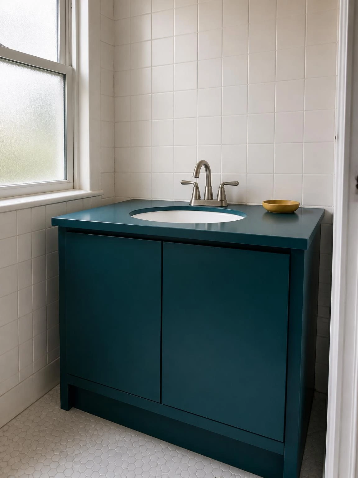
A bathroom vanity is one of the few pieces of furniture in the house that people interact with twice a day, which makes its condition very visible.
Repainting it in deep teal matte with warm white wall tiles behind and brushed nickel tap hardware makes a compact bathroom look intentionally designed rather than builder-standard.
A bathroom-specific topcoat with moisture resistance over the painted surface is necessary here, because a standard furniture topcoat will blister from daily water splashing.
A mustard ceramic soap dish on the counter is a small detail that connects the bathroom palette back to the kitchen without needing to redecorate either room.
Laminate vanity doors need thorough sanding and a dedicated bonding primer before painting; without both steps the paint tends to peel within a few months of daily use.
18- Coral Painted Fence Panels in a Side Yard
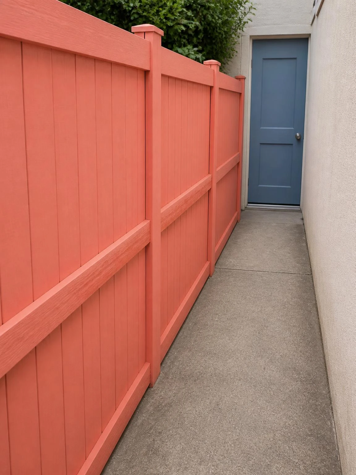
A side yard passage is usually the most neglected outdoor space and the first thing visible when the side gate is opened.
Painting three timber fence panels in soft coral transforms the corridor from a utility route into something that actually feels like part of the garden.
Exterior acrylic paint rated specifically for timber allows the wood to breathe and is less prone to blistering in the direct summer heat that a side passage often gets.
The stone-colored concrete path underfoot and a muted blue back door at the far end create a complete color story that costs only the price of the paint and a few hours.
Coral is a lighter color and coverage over previously dark-stained or dark-painted timber is thinner than expected; an extra coat on those panels is worth planning for.
Where do you want to go next?
Explore by topic
Recently viewed
19- Dusty Blue Painted Kitchen Island
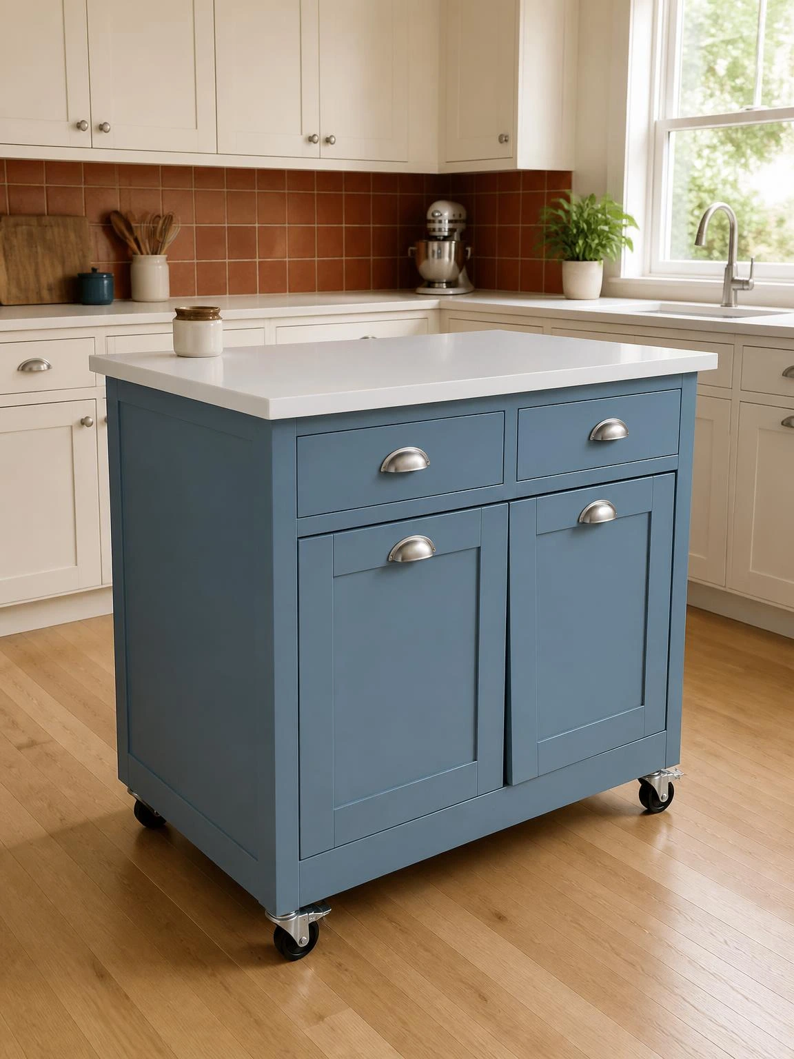
A freestanding kitchen island that matches the surrounding cabinets can look like an afterthought, as if it arrived with the house rather than being chosen.
Painting it in dusty blue while leaving the perimeter cabinets warm white gives the island its own identity and makes an open-plan kitchen feel more layered.
This is a lower-commitment refresh than repainting all the cabinets, and with a freestanding unit it realistically takes one weekend rather than several.
A terracotta ceramic tile backsplash above the perimeter counter ties the island’s dusty blue back to the bedroom and porch palettes used elsewhere in these ideas.
A freestanding island on castors needs to be locked in position before painting; any movement mid-coat shows up as an irregular brush stroke in the finished surface.
20- Forest Green Front Door Summer Update
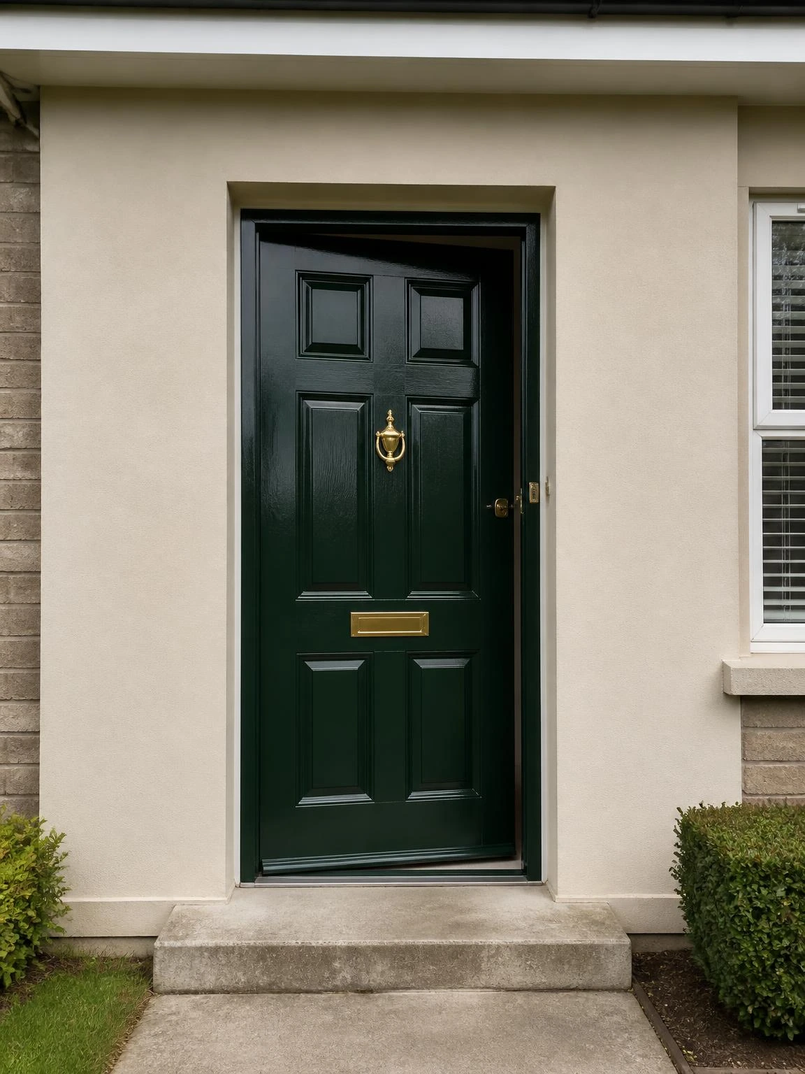
The front door is the first thing visitors see and often the last thing homeowners think to repaint.
Deep forest green exterior gloss on a solid timber door, with existing or new brass-finish hardware, is one of the most reliable curb appeal changes a house can get for the cost of a tin of paint.
Paint the door on a dry day above 10 degrees Celsius and leave it resting on the latch while the paint dries to prevent the fresh surface sticking to the frame.
Sanding back to a smooth surface and applying exterior wood primer before the topcoat is the difference between a finish that lasts several summers and one that peels by autumn.
South-facing doors in full summer sun heat up enough to cause standard gloss paint to blister; a heat-resistant exterior gloss formulation is the right product choice for that orientation.
Making Summer Color Work Across Your Home
The palettes across these 20 ideas share a handful of colors, which means changes in different rooms feel related rather than accidental.
Summer home decor ideas work best when they are reversible or low-cost, so a season of living with a new color does not feel like a permanent commitment.
Starting with one room and one change, whether a slipcover, a tin of paint or a new towel set, gives a clear sense of what the color actually looks like in the specific light of your home before going further.
The chair with the plum throw, the teal vanity, the green front door: individually they are small decisions, and together they make a house feel like it was dressed for the season on purpose.